 MegaMegaTypeType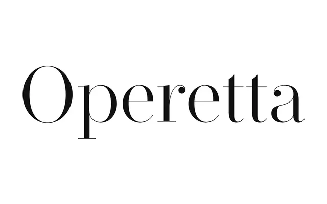
A neo-didone display serif in eight weights and five optical sizes, reworking Bodoni and Didot for contemporary use.
About
Operetta takes its stroke contrast from Bodoni, Didot and Walbaum but recalibrates it across five optical sizes, from an 8pt text cut to a 52pt display size, so contrast eases off at smaller sizes rather than collapsing. Eight weights from Extra Light to Black, each with an italic, are backed by a large glyph set with swashes and stylistic alternates. Built for editorial and branding work that wants classical didone character without the fragility.
Classification
Classic didone stroke contrast and hairline serifs place Operetta firmly in the didone tradition, alongside Bodoni and Didot.
Weights
Extra LightLightRegularMediumDemi BoldBoldUltra BoldBlack
Optical sizes and widths
8pt12pt18pt32pt52pt
Languages
Latin
Tags
didoneserifeditorialdisplayclassical