 MegaMegaTypeType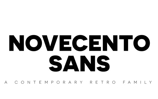
An uppercase-only geometric sans in eight weights across four widths, drawn from early-20th-century European modernist display faces.
About
Novecento Sans takes its bold, rationalist forms from the poster and signage lettering of early European modernism, refined into a 32-style family: eight weights from UltraLight to UltraBold across wide, regular, narrow and condensed widths. It has no lowercase, so it reads as a headline and branding face rather than a text one. Six of the wide styles are free for commercial use.
Classification
Uppercase-only construction with rationalist, geometric letterforms marks Novecento Sans as a display sans rather than a text face.
Weights
UltraLightLightBookNormalMediumDemiBoldBoldUltraBold
Optical sizes and widths
WideRegularNarrowCondensed
Family
Languages
Latin
Tags
geometricuppercase-onlydisplaymodernistbranding