 MegaMegaTypeType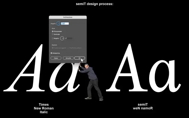
A back-slanted serif built by tilting Times New Roman's italic in reverse, producing a deliberately familiar yet disorienting typeface that functions at both text and display sizes.
About
Designed by Alessio D'Ellena with Federico Antonini between 2015 and 2023, semiT takes the italic of Times New Roman as its conceptual starting point and applies a counter-slope, creating what the foundry calls an 'anti-Kursiv'. The result sits in an uncanny middle ground: readable enough for running text, odd enough to draw attention at larger sizes. Two weights, Regular and Bold, are supported by a broad Latin language range and a full set of OpenType features including fractions, ligatures and case-sensitive forms.
Classification
A serif typeface derived speculatively from the italic of Times New Roman, tilted back to produce a counter-italic or anti-kursiv effect. The foundry self-classifies it as 'ripoff, speculative, serif', placing it firmly in experimental territory while retaining traditional serif construction.