 MegaMegaTypeType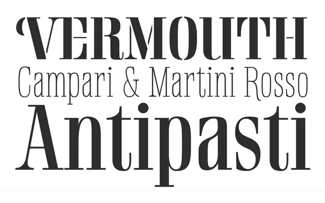
A highly readable Didone display serif based on a German mid-century lettering specimen, with a two-weight stencil variant.
About
Rigatoni's tall letterforms and sturdy serifs give it a noble bearing in all caps, while the large x-height and spacious counters keep the lower case welcoming. Sudtipos commissioned 3D visualisations from designer Esteban Diácono for its intended use on restaurant menus and food packaging.
Classification
Based on a German mid-century lettering specimen by Nerdinger, a Didone display family with a notably readable lower case and a two-weight stencil variant.
Weights
ThinLightRegularBoldExtra Bold
Languages
LatinLatin Extended
Tags
serifdidonefoodeditorialstencil