 MegaMegaTypeType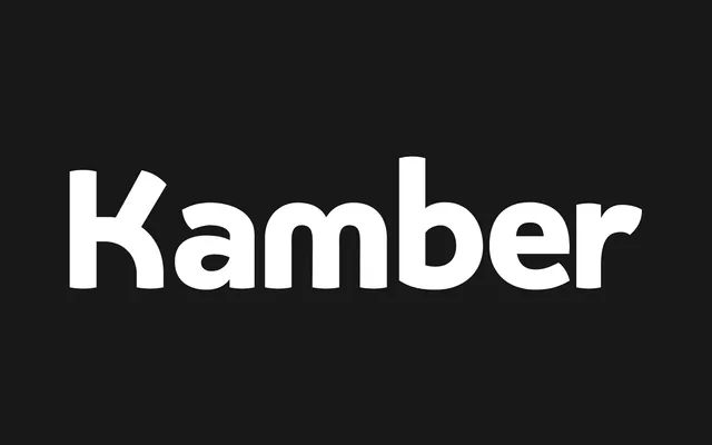
Jonny Gibson's 2018 sans-serif balances neo-grotesque structure with humanist warmth through convex terminals and a high x-height, available across eight weights with matching italics.
About
Kamber sits between grotesque restraint and humanist personality, using subtle convex terminals and a curved letterform construction to create a distinct, approachable rhythm without tipping into novelty. Its x-height runs at approximately 70% of cap height, keeping running text legible while the letterforms retain enough character for display use. Sixteen styles cover eight weights with corresponding italics, supported by small caps, ligatures, old-style figures and stylistic alternates.
Classification
A neo-grotesque sans-serif with humanist influences, featuring subtle convex terminals, a curved structure and an elevated x-height. The foundry classifies it as a humanist sans-serif, sitting between grotesque neutrality and the warmer, more characterful humanist tradition.