 MegaMegaTypeType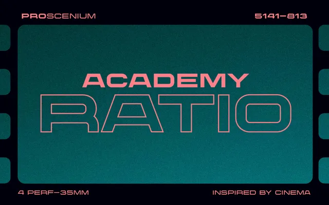
A wide sans-serif in three weights with italics, built around the proportions of widescreen cinema formats and title card typography.
About
Designed to complement letterbox aspect ratios typical of 35mm, 65mm and 70mm film, the typeface draws on the tradition of opening title and credit sequence lettering. Three weights -- Light, Regular and Bold -- each carry a matching italic, covering full alphabets, numerals, punctuation and multilingual characters. It reads equally well in print and digital contexts, from editorial headers to album art.
Classification
A display-oriented wide sans-serif designed explicitly for widescreen cinematic proportions, drawing on the tradition of film title typography. Its extended letterforms and clean geometry place it firmly in the display category rather than text use.