 MegaMegaTypeType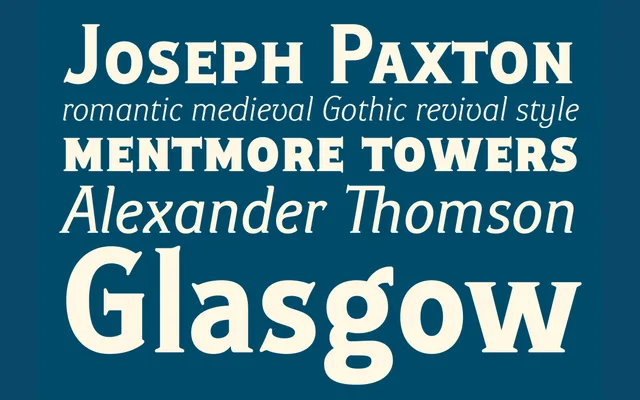
A Victorian-style grotesque with just enough hidden serif to escape dullness.
About
Ideal Gothic answers a very old complaint about monolinear alphabets being dull, adding subtle stroke contrast and quietly curved, hidden serifs instead of stripping decoration away altogether. Five weights with italics suit brochures, calendars, maps and corporate identity work.
Classification
Despite the name, this reads as a sans-serif grotesque in the old American sense of Gothic, not a blackletter, and its faint curved serifs confirm it.
Weights
BookRegularBook BoldBoldBlack
Languages
Latin Extended
Tags
sans-serifgrotesquevictoriangothic revivalcorporate