 MegaMegaTypeType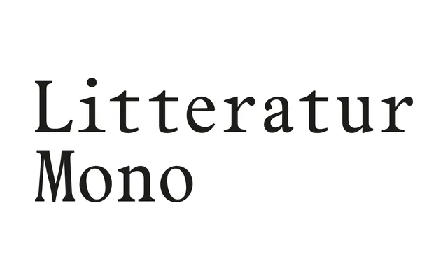
A monospaced companion to Litteratur that carries the sturdy old-style serif character of early twentieth-century Norwegian literary printing into a fixed-width, typewriter-inspired format.
About
Designed by Arve Båtevik, Litteratur Mono inherits the pronounced serifs, generous x-height and compact vertical proportions of Litteratur, which itself draws on sources including Nordisk Antikva and Plantin. In its monospaced form these qualities produce a firmer mechanical rhythm while retaining the historical warmth of the parent family. The typeface suits branding, editorial work and typographic systems where a fixed-width serif needs a distinct literary character, and pairs naturally with Litteratur for use within the same visual identity.
Classification
A fixed-width serif typeface drawing on old-style serif traditions such as Nordisk Antikva and Plantin, adapted into a monospaced format with typewriter-inspired rhythm. The pronounced serifs and compact proportions situate it firmly within the serif mono category.