 MegaMegaTypeType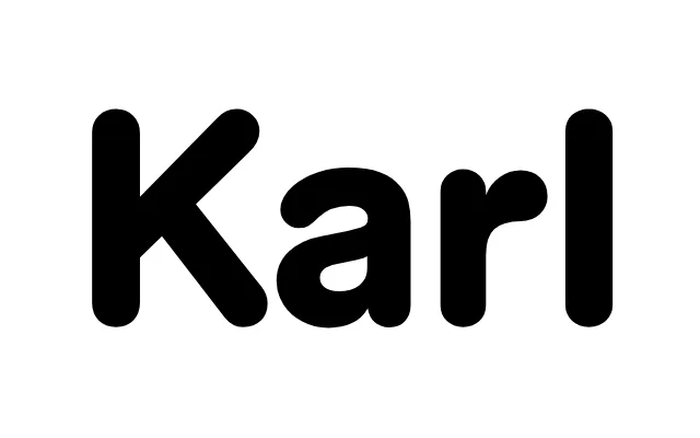
A rounded sans-serif revived from Karl Gerstner's unreleased 1964 Shell identity proposal, expanded by Laurenz Brunner into a full family spanning five weights with italics and a monospace cut.
About
Gerstner proposed rounded forms to suggest the viscosity of oil and to mimic how backlit signs blur when seen from a moving car. Brunner found the shelved project during an apprenticeship at GGK and built it into a full family, from Regular to Ultra with italics and a monospace. It reads as a contemporary rounded sans with a specific Swiss back story.
Classification
A rounded sans with even strokes, developed from Karl Gerstner's 1964 Shell identity proposal. The rounded terminals were meant to mimic backlit signs seen from a moving car, so they are structural rather than decorative.