 MegaMegaTypeType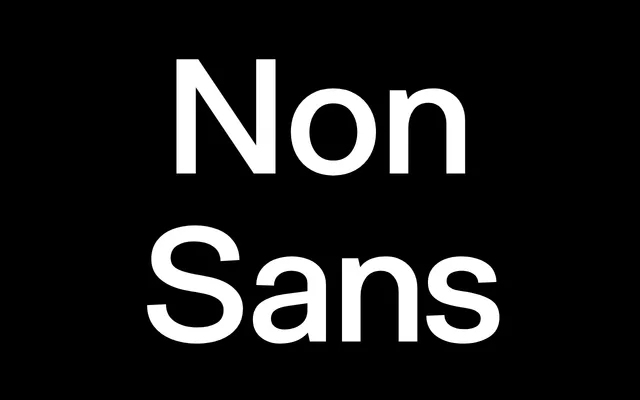
A dense, modular grotesque rooted in 1960s Swiss type design, refined for editorial, interface and signage use.
About
Non Sans reads as compact and reliable, with a solid reading rhythm that traces back to the functional, modular shapes of 1960s Swiss type. A 2022 revision unified x-heights and weight consistency and added a slanted style alongside the existing rotation-based alternate. Five weights, each with slant and rotation variants, give it real range for identity, editorial and interface work.
Classification
A dense, modular grotesque with clear roots in 1960s Swiss type design, refined in a 2022 revision, places this as a classic grotesque.
Weights
LightBookRegularMediumBold
Languages
Latin Extended
Tags
grotesqueswisseditorialsignageinterfaces