 MegaMegaTypeType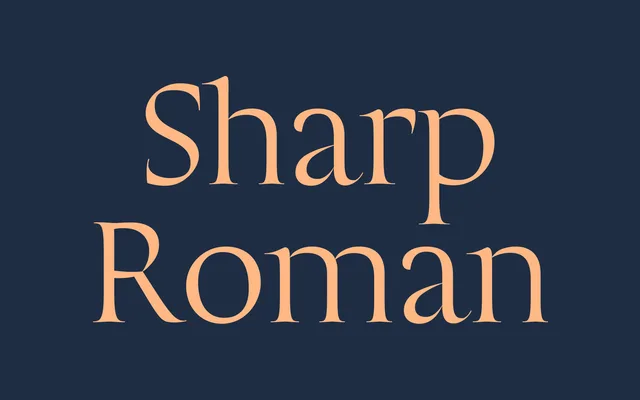
A calligraphic display serif combining Trajan inscriptional roman capitals with Morantesque italic penwork, offered across five optical sizes.
About
Sharp Roman Display unites two historically distant lettering traditions in a single calligraphic family: Lucas Sharp's interpretation of Trajan Monumental Roman Capitals (via Edward Catich's scholarship) for the upright roman, and the italic penwork of 17th-century Spanish calligrapher Pedro Diaz Morante. The two traditions share enough calligraphic architecture to cohere as a family, feeling antique in its references and precise in execution. Five optical sizes (10 through 45) extend its range from fine-print text settings to large-scale display use.
Classification
A calligraphic display serif uniting two historically distinct letterform traditions. The upright roman draws on Trajan Monumental Roman Capitals as interpreted through Edward Catich's scholarship; the italic is rooted in the penwork of 17th-century Spanish calligrapher Pedro Diaz 'El Maestro' Morante. Full marketed name is Sharp Roman Display. Offered in five optical sizes (10, 15, 25, 35, 45) across both Roman and Italic cuts — a total of ten styles. Extensive OpenType feature support: calt, liga, onum, lnum, tnum, frac, case, ordn, ss01–ss04, subs, sups, locl, and more.