 MegaMegaTypeType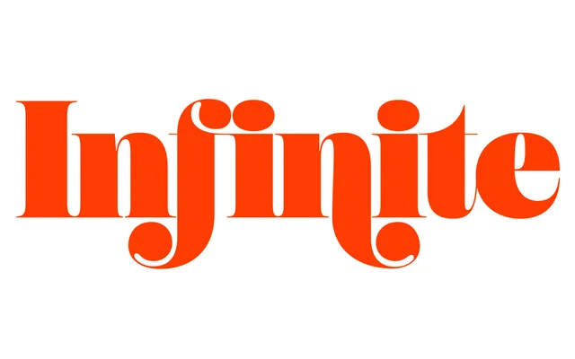
A swooping 1960s-style fat face Didone with swashes up top and a sturdier Text cut below.
About
Falutin pushes Didone contrast as far as it goes, with fat strokes against hairline serifs and fat teardrop terminals, tightly spaced for big titles. The swagger calms down as the weight drops, and the light end is crisp and refined. Title adds a set of swashes, while Text thickens the serifs and adds ink traps for reading sizes.
Classification
Didone fat face after 1960s designs such as Pistilli Roman and Benguiat Montage, with teardrop terminals and very high contrast. Three subfamilies, Title (with swash alternates), standard and Text (thicker serifs, ink traps, looser spacing), each in seven weights from Thin to Ultra. No italics.
Weights
ThinLightRegularMediumSemiBoldBoldUltra
Optical sizes and widths
TitleText
Family
Falutin TitleFalutin Text
Languages
LatinLatin ExtendedVietnamese
Tags
serifdidonefat facehigh contrastswashesoptical sizes1960sheadlineeditoriallogotype