 MegaMegaTypeType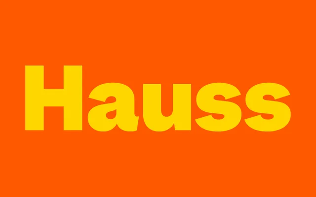
A workhorse grotesque drawn from 19th-century Monotype sources, refined across seven weights with characterful italics pitched at a steep 12-degree angle.
About
Hauss is a sans-serif grotesque designed by Justin Sloane and Huw Williams, developed over several years as a personal design tool before being released through Sharp Type in October 2024. Its Thin weight draws on an early Monotype grotesque specimen discovered at The Letterform Archive in 2022, while the heavier weights shift register, referencing Akzidenz Grotesk and Genzch & Heyse Blockschrift for a more display-oriented character. The italics are set at a steep 12-degree angle using rotated rather than oblique logic, preserving the roundness of the roman across the range.
Classification
Early 19th-century Monotype grotesque revival. Thin weight sparked by a specimen at The Letterform Archive in 2022; heavier weights (Bold, Black) reference Akzidenz Grotesk and Genzch & Heyse Blockschrift. Italics use a steep 12-degree angle with rotated logic rather than a pure oblique slant. 14 styles across 7 weights, roman and italic.