 MegaMegaTypeType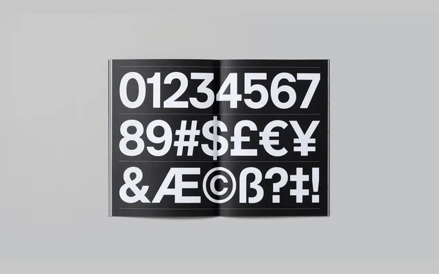
A compact neo-grotesque in five weights with oblique italics and a variable axis, built on CoType's RM lineage dating back to 2011.
About
RM Neue is a neo-grotesque sans-serif with compact proportions and low contrast, drawing from utilitarian type traditions. First released as RM in 2011 and fully redesigned in 2019, it spans five weights from Light to Black, each paired with an oblique, plus a variable font for continuous weight adjustment. Considered detailing sets it apart from generic grotesques: the default 'l' carries a curly serif, with OpenType alternates for a single-storey 'a' and alternate 'R', 'G' and '3' forms.
Classification
Compact neo-grotesque with low contrast and consistent stroke weight. Ascenders match cap height. Default 'l' carries a curly serif to prevent confusion with capital 'I'. OpenType alternates include a single-storey 'a', seriffless 'l', and alternate forms for 'R', 'G' and '3'. Italics are oblique rather than true drawn italics. Variable font available across the weight axis.