 MegaMegaTypeType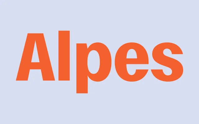
A condensed grotesque superfamily co-designed by Image Format's Johan Mossé and Quentin Berthelot, balancing compact form against expressive personality across six weights with roman and italic cuts and a matching mono companion.
About
Alpes is a condensed grotesque built on switchbacking curves, sharp angles and steely straight lines. The result is a typeface with a compact footprint that carries genuine personality, equally at home in editorial display settings and technical contexts. It is the second collaboration between Sharp Type and Paris studio Image Format, and comes paired with Alpes Mono for fixed-width use.
Classification
A single-width condensed grotesque characterised by switchbacking curves, sharp angles and steely straight lines. Sits at the intersection of editorial display and technical use, with enough formal tension to avoid the blandness common in utilitarian condensed grotesques.