 MegaMegaTypeType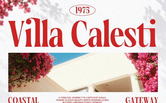
A high-contrast Didone serif with two styles – Regular and Italic – aimed at editorial, branding and luxury design contexts.
About
Vorseta offers the characteristic thick-and-thin stroke contrast of the Didone genre, with graceful curves intended to evoke a timeless editorial aesthetic. The family is minimal in scope, comprising just a Regular and an Italic. It targets branding, logo work and invitation design where decorative presence takes priority over text utility.
Classification
High-contrast thick-and-thin strokes and graceful curves place this firmly in the Didone tradition, designed for editorial and luxury applications.
Weights
Regular
Languages
Latin
Tags
didoneeditorialeleganthigh-contrastserifluxuryweddingdisplay