 MegaMegaTypeType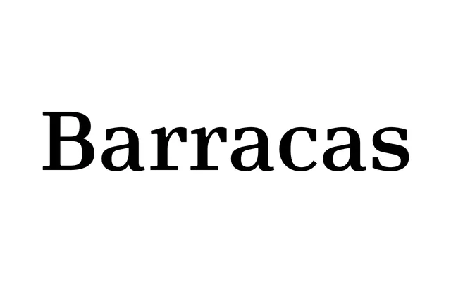
A high-contrast display serif rooted in the visual identity of Buenos Aires' Barracas neighbourhood, available in five styles including a stencil cut.
About
Designed as part of a master's degree at the University of Buenos Aires, the typeface takes its cue from the contrasts of the Barracas district, translating that tension into a high-contrast letterform with strong presence and refined finishes. The family spans Regular, Italic, Poster, Poster Italic and Stencil, covering editorial, headline and applied uses. OpenType features include small capitals, discretionary ligatures, stylistic alternates and fractions.
Classification
A high-contrast serif with strong vertical stress and robust finishes, developed with a display orientation. The Stencil variant and Poster cuts reinforce its display-first nature, while the overall contrast and presence align it with contemporary Latin American editorial display typography.