 MegaMegaTypeType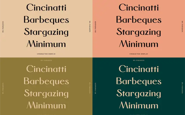
BN Paradox is a minimalist high-contrast serif that balances thin and thick strokes to create an elegant yet approachable display face.
About
The typeface uses simple, restrained letterforms as a scaffold for pronounced weight contrast, giving headlines a refined but not cold character. It is Latin-only at present, with no extended European or foreign glyph support included. The tension between its minimal structure and its stroke contrast is the source of its name.
Classification
Described as minimalist with simple forms and contrasting weights, suggesting a high stroke-contrast serif intended for display use rather than body text.
Languages
Latin
Tags
displayserifhigh-contrastminimalistelegant