Norman
Resistenza Type · Giuseppe Salerno, Paco González · 2020
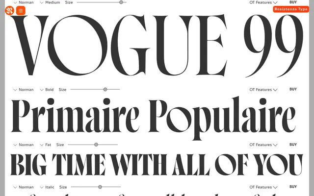
A condensed, high-contrast display serif with an oblique axis, designed for editorial headlines and fashion-forward branding.
About
Norman is built on an expansion-based construction – condensed proportions with sharp stroke contrast and a deliberate oblique stress that gives it a contemporary edge. Designed by Giuseppe Salerno and Paco González and released by Resistenza in 2020, it ships in five weights with matching italics, a variable version and a stencil extension. It has appeared on Emily Ratajkowski's book cover, Guitar World magazine and various high-profile music releases – credible real-world deployment for a display-only face.
Classification
Condensed proportions with extreme stroke contrast built on an expansion-based construction; distinctive oblique stress axis gives it a contemporary, fashion-inflected character. Related to the Didone tradition but interpreted through a modern display lens rather than a revival framework.