 MegaMegaTypeType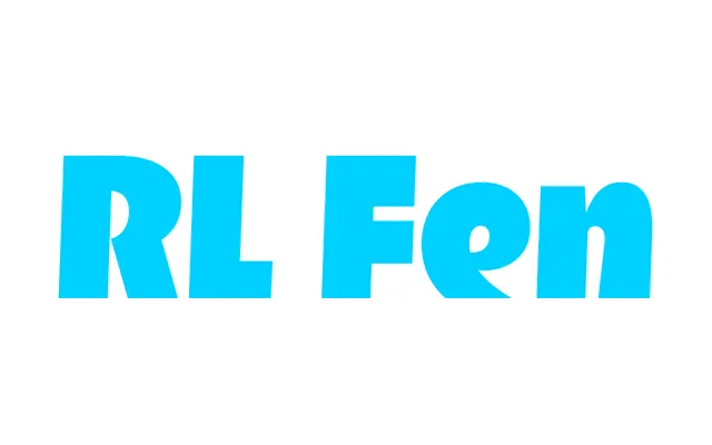
A single-style Black display typeface from 2025, built around abrupt cuts on curved letters and brush-influenced strokes to convey a sense of forward motion.
About
The lowercase centres on dynamic curves interrupted by sharp, clean cuts on letters such as s, c and e, giving the impression of type moving too fast to settle. Uppercase characters like C and S are drawn with deliberate airiness, making all-caps settings comfortable and open. French typographic influence appears through brush-affected stroke modulation, while a nod to classical Latin and Greek forms adds an unexpected archaic undercurrent.
Classification
A single-weight display typeface with expressive, motion-driven letterforms. Dynamic curves with abrupt cuts and brush-influenced strokes place it firmly in the display category, with no body text intention.