 MegaMegaTypeType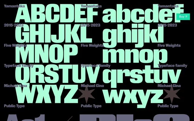
Originally designed in 2015 for a documentary about death, this five-weight sans draws on early gothic type traditions to balance organic irregularity with quiet formal authority.
About
Yamantaka takes the Royal Gothic genre as its point of departure, deliberately rejecting the precision-driven uniformity of contemporary typefaces in favour of irregular, organic letterforms. Extensive experimentation expanded the character set and reshaped the overall texture, introducing a weight and grandeur that makes even short passages feel substantial. Nineteen stylistic sets and a broad range of alternate glyphs give designers considerable control over the typeface's character.
Classification
A sans-serif display face rooted in early gothic and Royal Gothic aesthetic traditions, embracing organic irregularity over geometric precision. Its historical resonance and deliberate unconventionality place it firmly in the display category.