 MegaMegaTypeType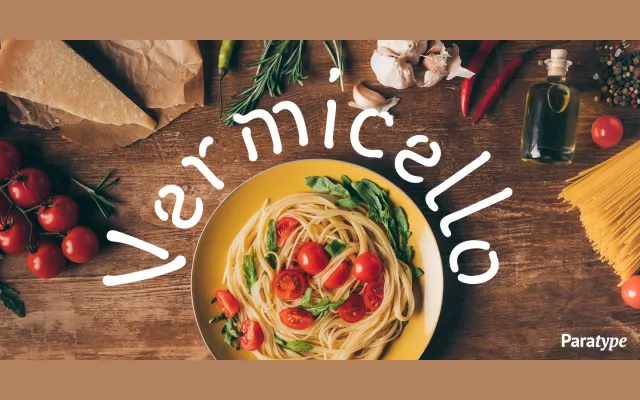
A single-weight display face by Isabella Chaeva in which letters are assembled from separate monoline strokes imitating a broad felt-tip pen, giving each character a worm-like, wriggling quality.
About
Designed for ParaType in 2007, Vermicello breaks letterforms into discrete curved elements rather than continuous strokes, producing an informal, fragmented texture at display sizes. The name refers directly to the worm-like quality of its curvy traces, drawn from the idiom of casual felt-tip handwriting. It is intended for advertising, poster and magazine contexts where an animated, decorative tone is required.
Classification
A decorative display face built from fragmented monoline strokes that mimic informal handwriting with a felt-tip pen. Its free-form, playful construction places it firmly in the display category with an informal, script-adjacent character.