 MegaMegaTypeType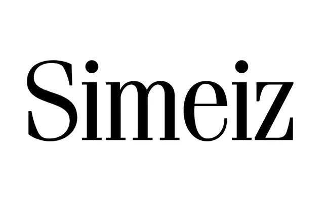
A 1994 Russian adaptation of ITC Fenice by Nikita Vsesvetsky, offering four weights with italics across a high-contrast transitional serif design.
About
Designed at SoftUnion in 1994, Simeiz is based on Aldo Novarese's ITC Fenice (1977–1980), inheriting its characteristic high stroke contrast and refined bracketed serifs. The family spans four weights – Light, Book, Demi Bold and Bold – each with a matching italic. Published and distributed through ParaType.
Classification
The specimen shows high stroke contrast, bracketed serifs and refined letterforms consistent with the ITC Fenice lineage – a transitional serif with neoclassical tendencies. The upright 'i' dots are circular and the overall construction is elegant and vertical.
Weights
LightBookDemi BoldBold
Languages
LatinCyrillic
Tags
seriftransitionalhigh-contrastelegantmagazineeditorialcorporatenovarese