 MegaMegaTypeType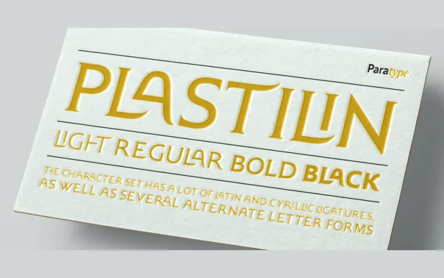
A display serif with soft, curved terminals and pointed serifs designed to evoke the look of letters extruded from plastic mass, released by Oleg Karpinsky for ParaType in 2005.
About
The four-weight family takes its name from the pliable, sculpted quality of its letterforms, particularly visible in characters such as J, K, L and R. An extended character set includes additional Latin and Cyrillic ligatures and alternate letter forms, broadening its typographic range. Originally released in two weights, Light and Black were added in 2008 alongside refinements to several letterforms.
Classification
Soft, curved stroke terminals and small pointed serifs give the letterforms a plastic, extruded quality that places this firmly in the display serif category, distinct from traditional book or text serif conventions.