 MegaMegaTypeType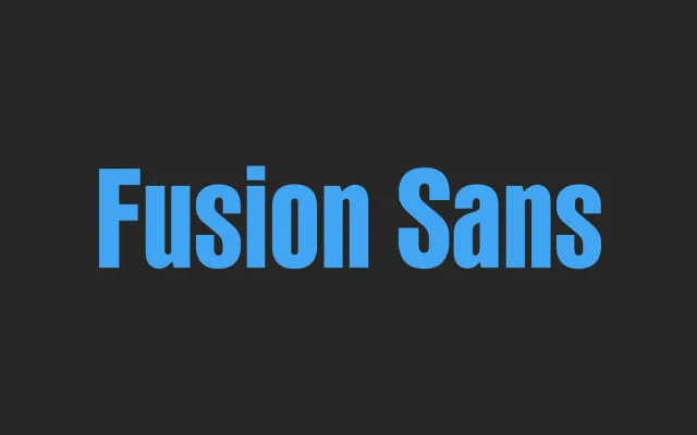
A tall four-weight sans-serif family drawing on early nineteenth-century grotesque forms, with roman details such as a two-storey 'g' and stroke thinning at round-to-stem junctions.
About
Fusion Sans blends historical sans-serif letterforms with roman characteristics, incorporating a double-storey 'a' and 'g' and selective stroke modulation at joins rather than a strictly monotone construction. The lowercase 't' references a typeface developed by Paul Rand for Westinghouse in 1960. The Pro version, released in 2006, extends coverage to Latin, Greek and Cyrillic scripts and includes 19 OpenType features including small caps and old-style figures.
Classification
Described as an amalgamation of early nineteenth-century sans-serif letters with roman features such as a two-storey 'g' and stroke thinning at junctions, placing it in the humanist sans tradition despite a largely monotone structure.