 MegaMegaTypeType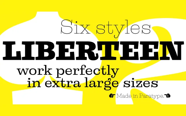
A six-weight display slab serif loosely inspired by 19th-century Clarendon faces, blending historical letterforms with post-modern detailing.
About
Designed by Alexander Lubovenko and released by ParaType in 2015, Liberteen treats the Clarendon tradition as a point of departure rather than a blueprint for revival. The extreme weights perform best at large sizes, while the Regular is usable for short text. Old-style figures, alternates and discretionary ligatures extend its decorative range.
Classification
A display slab serif rooted in 19th-century Clarendon-style faces, with bracketed serifs and pronounced stroke contrast. The design is a free interpretation rather than a strict revival, incorporating post-modern detailing alongside traditional slab forms.
Weights
ThinLightRegularMediumBoldBlack
Languages
Latin
Tags
slab-serifclarendondisplay19th-centuryretrovintagedecorativeheading