 MegaMegaTypeType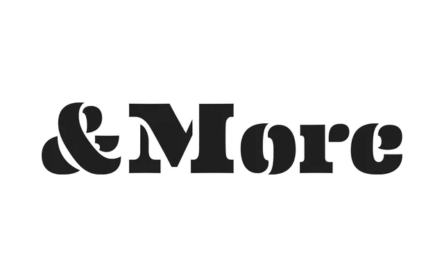
A warmly expressive slab serif from House Industries that fuses Clarendon structure with Scotch italic influences, released in 2010 with 18 weights, stencil variants and multiple decorative numeral sets.
About
Designed by Erik van Blokland, Andy Cruz and Ken Barber, the family draws from the broad Clarendon tradition while borrowing the ribbon-like, ball-terminal-rich quality of Scotch serifs for its italics. A subtle inward flex on flat stroke sides softens the heavier weights, preventing the design from feeling imposing. Beyond the text weights, the family extends into two stencil variants and four numeral sets ranging from bulbous poster forms to skeletal cover lettering, all rooted in Charles and Ray Eames' mid-century graphic vocabulary.
Classification
A slab serif in the Clarendon tradition, with smooth brackets and pronounced ball terminals, blended with Scotch serif influences particularly visible in the italics. The design sits between the bold, upright character of a Clarendon and the more ornate, ribbon-like quality of a Scotch roman.