 MegaMegaTypeType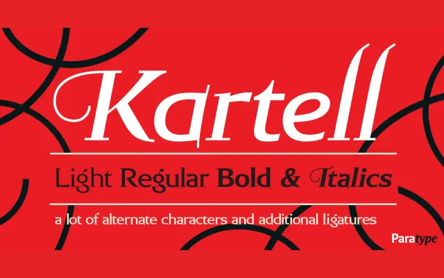
A low-contrast serif family by Oleg Karpinsky, issued in 2006 with three weights, matching italics and an OpenType feature set including alternates, swashes and discretionary ligatures.
About
Designed for ParaType in 2006, Kartell pairs slim serifs with reduced stroke contrast to maintain readability across extended text settings in magazines, books and newspapers. Its OpenType version includes alternate characters, additional ligatures and swashes, broadening its range into display and identity work. Three weights with corresponding italics give it modest but practical versatility.
Classification
A text serif with low stroke contrast and slim serifs, characteristics that place it in the humanist or old-style serif tradition, designed for sustained readability across editorial contexts.