 MegaMegaTypeType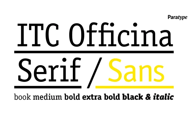
A slab serif designed by Erik Spiekermann and Just van Rossum in 1990 as a bridge between typewriter type and conventional typography, extended with Cyrillic support by ParaType.
About
Originally designed for the International Typeface Corporation, the face prioritises even character widths and sturdy letterforms that remain legible at small sizes and survive low-resolution printing, photocopying and fax reproduction. The Latin family was expanded with additional weights and small caps by Ole Schaefer in 1998, while ParaType developed the Cyrillic version in 1994 under Tagir Safayev, with further Cyrillic weights and small caps added by Olga Chaeva in 2003. The ten-style range spans Book through Black, each with a matching italic.
Classification
A slab serif with even stroke contrast and uniform character widths, rooted in typewriter typography tradition. Its sturdy construction and bracketed serifs place it firmly in the humanist slab category, designed for legibility under demanding reproduction conditions.