 MegaMegaTypeType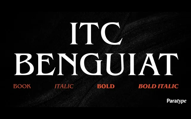
Ed Benguiat's 1977 ITC design, with its exaggerated sharp serifs and raised midline stress, extended to Cyrillic by Vladimir Yefimov for ParaType in 2001.
About
Originally drawn for the International Typeface Corporation in 1977, ITC Benguiat carries a strong Art Nouveau personality through its exaggerated sharp serifs, raised midline and stress concentrated in the upper half of capitals. The face demands selective use – its distinctive character suits display and poster work as much as body text. The Cyrillic extension, developed by Vladimir Yefimov in 2001, brings the same expressive qualities to Russian-language typography.
Classification
A roman serif with exaggerated sharp serifs and pronounced Art Nouveau influence, featuring stress laid on the upper half of capitals and a raised midline – characteristics that place it firmly in the decorative serif tradition rather than any classical subgroup.