 MegaMegaTypeType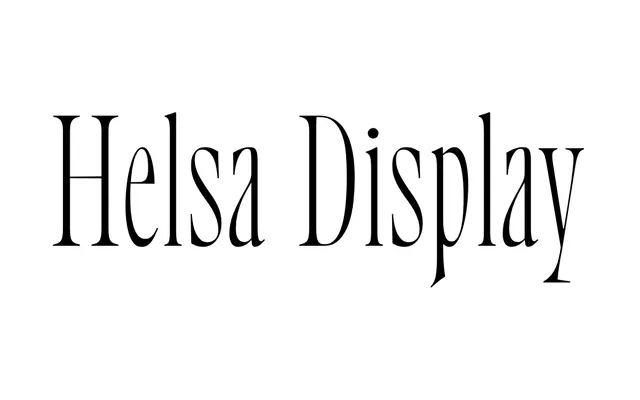
A single-weight, narrow display serif by Nikolay Nedashkovsky, drawing on early 20th-century Elsevier types with high stroke contrast and over 1600 characters covering extended Cyrillic, Greek and Vietnamese.
About
Developed at ParaType between 2020 and 2022, the design takes Dutch narrow Elsevier models as its starting point, incorporating details from American type catalogues and the Wolf and Herbeck foundries. The compressed proportions and high stroke contrast let type size increase freely without crowding the line, making it well suited to headings, branding and poster work. The character set includes arrows, circled numerals, card suits, plastic-type symbols and a full suite of OpenType features including old-style and tabular numerals, titular alternates, fractions and ligatures.
Classification
A narrow, high-contrast serif inspired by early 20th-century Elsevier types, combining Dutch letterform traditions with references to American type catalogues and German foundries. The extreme stroke contrast and compressed proportions place it firmly in the display serif category.