 MegaMegaTypeType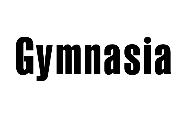
A bold condensed grotesque designed at Intermicro between 1992 and 1995, closely related in form to Fred Lambert's Compacta for Letraset.
About
Gymnasia follows the tradition of tightly packed condensed grotesques, drawing explicit comparison to Compacta (1963–1965). Available in a single Regular style, its narrow set width and dense colour suit headline and display applications. It was developed within the InterMicro studio and is distributed through ParaType.
Classification
Tightly condensed sans-serif with high stroke contrast reduction and compact proportions, similar in character to Compacta. The specimen shows a bold condensed grotesque with near-vertical stress and very narrow set width.
Weights
Regular
Languages
Latin
Tags
condensedgrotesqueboldcompactdisplaymagazinenarrow