 MegaMegaTypeType
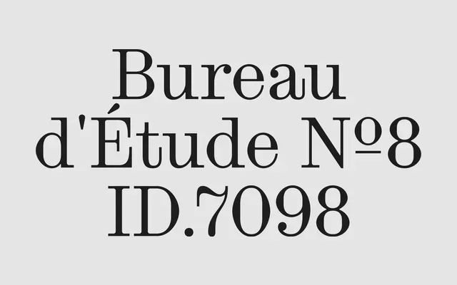
Inès Davodeau's contemporary Didone, softer and more expressive than the genre usually allows, with a roman, an italic and a matching Mono.
About
Press keeps the high contrast and sharp serifs of the neoclassical Didones but loosens them with ball terminals, open details and a slightly industrial edge. The Mono and Mono Italic carry the same contrast onto a fixed width, which reads like an upmarket typewriter. Made for fashion, branding, editorial headlines, packaging and posters.
Classification
High-contrast vertical-stress serif with sharp hairline serifs and dramatic thick-thin transitions characteristic of the Didone genre, described explicitly as a contemporary Didone throughout the foundry's copy.
Weights
RegularRegular ItalicMonoMono Italic
Family
Press Mono
Languages
AfrikaansAlbanianAsuBasqueBembaBenaBosnianCatalanCebuanoChigaColognianCornishCorsicanCroatianCzechDanishDutchEmbuEnglishEsperantoEstonianFaroeseFilipinoFinnishFrenchFriulianGalicianGandaGermanGusiiHungarianIcelandicIdoInari SamiIndonesianInterlinguaIrishItalianJavaneseJjuJola-FonyiKabuverdianuKalaallisutKalenjinKambaKikuyuKinyarwandaKurdishLatvianLithuanianLojbanLow GermanLower SorbianLuoLuxembourgishLuyiaMachameMakhuwa-MeettoMakondeMalagasyMalayMalteseManxMaoriMeruMorisyenNorth NdebeleNorthern SamiNorthern SothoNorwegian BokmålNorwegian NynorskNyanjaNyankoleOccitanOromoPolishPortugueseRomanianRomanshRomboRundiRwaSamburuSangoSanguSardinianScottish GaelicSenaShambalaShonaSicilianSlovakSlovenianSogaSomaliSouth NdebeleSouthern SothoSpanishSwahiliSwatiSwedishSwiss GermanTaitaTarokoTesoTsongaTswanaTurkishTurkmenUpper SorbianVunjoWalloonWalserWelshWestern FrisianWolofXhosaZulu
Tags
didonehigh-contrastdisplayeditorialfashionbrandingcontemporarymono