 MegaMegaTypeType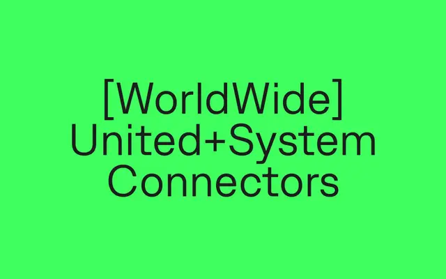
A neutral grotesque by Tim Vanhille spanning ten weights with matching italics, built for legibility in both UI and editorial contexts.
About
Clean proportions and open counters give Last a quietly assured character without straying into anonymity. Balanced spacing and a consistent rhythm make it comfortable at small sizes while retaining presence in display settings. Broad language support and OpenType features position it for international design systems requiring technical reliability.
Classification
A contemporary grotesque with neutral, restrained forms and open counters, placing it firmly in the functional grotesque tradition designed for legibility across print and digital contexts.
Weights
HairlineThinExtraLightLightRegularMediumSemiBoldBoldExtraBoldBlack
Languages
AfrikaansAlbanianAsuBasqueBembaBenaBosnianCatalanCebuanoChigaColognianCornishCorsicanCroatianCzechDanishDutchEmbuEnglishEsperantoEstonianFaroeseFilipinoFinnishFrenchFriulianGalicianGandaGermanGusiiHungarianIcelandicIdoInari SamiIndonesianInterlinguaIrishItalianJavaneseJjuJola-FonyiKabuverdianuKalaallisutKalenjinKambaKikuyuKinyarwandaKurdishLatvianLithuanianLojbanLow GermanLower SorbianLuoLuxembourgishLuyiaMachameMakhuwa-MeettoMakondeMalagasyMalayMalteseManxMaoriMeruMorisyenNorth NdebeleNorthern SamiNorthern SothoNorwegian BokmålNorwegian NynorskNyanjaNyankoleOccitanOromoPolishPortugueseRomanianRomanshRomboRundiRwaSamburuSangoSanguSardinianScottish GaelicSenaShambalaShonaSicilianSlovakSlovenianSogaSomaliSouth NdebeleSouthern SothoSpanishSwahiliSwatiSwedishSwiss GermanTaitaTarokoTesoTsongaTswanaTurkishTurkmenUpper SorbianVunjoWalloonWalserWelshWestern FrisianWolofXhosaZulu
Tags
grotesqueneutralworkhorseuieditorialbrandinglegibilityfunctional