 MegaMegaTypeType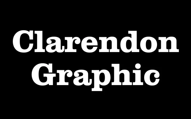
François Rappo's modernist Clarendon, with moderate contrast, ball terminals and bracketed serifs across a wide weight range and a stencil companion.
About
Clarendon Graphic takes the 1845 Clarendon genre, and Hermann Eidenbenz's 1950s adaptation, in a more graphic direction. It is lighter than the old Egyptians, with moderate contrast, ball terminals, upturned tails and prominent bracketed serifs, and runs from Hairline upwards with a stencil cut alongside.
Classification
A Clarendon-style slab serif with bracketed serifs and moderate stroke contrast, offered in an unusually wide weight range including hairline, ultrathin, thin, ultralight, light, and medium cuts, plus a stencil variant.
Weights
HairlineUltrathinThinUltralightLightMedium
Family
Clarendon Graphic Stencil
Languages
Latin
Tags
clarendonslabstencildisplayeditorialhistoricalhigh-contrasthairline