 MegaMegaTypeType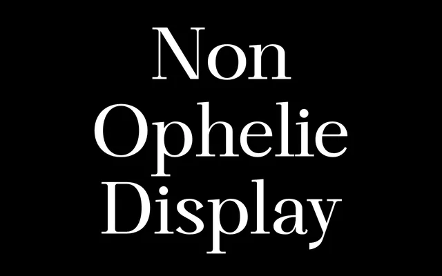
A high-contrast display face built around an expressive, fluid lowercase 'a', now extended to Cyrillic and Greek.
About
Non Ophélie Display grew from a single letter, a fluid, fast-moving lowercase 'a', with that same energy carried through the rest of the alphabet. Six weights with italics perform best at large sizes, where the thin-thick contrast and terminal details read clearly. Version 2.0 added Cyrillic and Greek coverage plus stylistic ligatures and alternate capitals.
Classification
High contrast between thick and thin strokes, an expressive lowercase 'a' as its defining letter, and optimisation for large sizes place this firmly as a display face.
Weights
ThinLightRegularMediumBoldBlackThin ItalicLight ItalicRegular ItalicMedium ItalicBold ItalicBlack Italic
Languages
LatinCyrillicGreek
Tags
displayhigh-contrastexpressiveeditorialmultiscript