 MegaMegaTypeType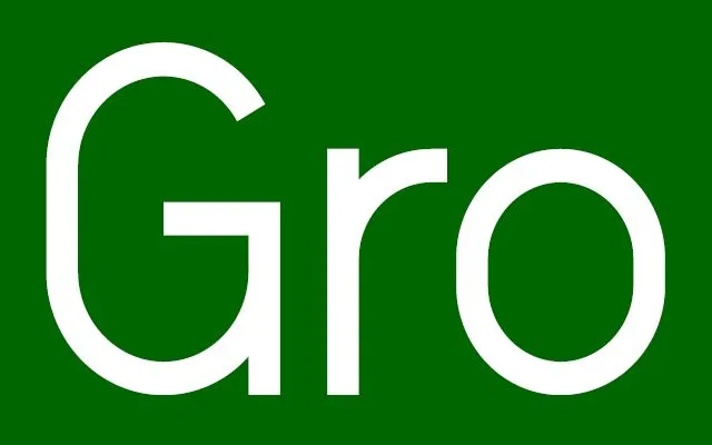
Neubau's most recognisable typeface, a monoline neo-grotesque built without optical correction on a strict diamond grid.
About
NB Grotesk was developed for the 'Neubauism' exhibition in Eindhoven in 2008 and remains the studio's most widely used family. Six weights follow a diamond-grid construction that deliberately skips optical correction, giving it a raw, slightly mechanical character. Rounded and monospace siblings extend it further.
Classification
A monoline neo-grotesque built on a strict diamond grid with no optical correction, giving it a deliberately raw grotesque character.
Weights
Ultra LightLightRegularSemiboldBoldBlack
Family
Languages
Latin
Tags
grotesqueconstructedrawbrandingflagship