 MegaMegaTypeType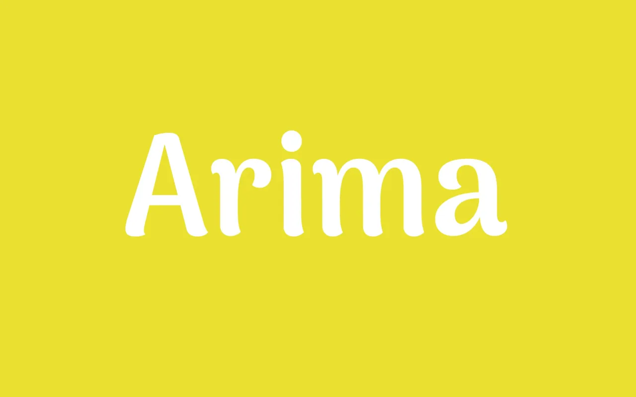
A calligraphic display family with soft edges and low contrast, designed for headline and branding use on screen across a broad range of scripts and languages.
About
Arima balances personality with legibility, using soft edges and a calligraphic feel to create a distinctive face suited to headlines, brand names and web display contexts. Its low contrast aids screen rendering, and each weight was tested on low-resolution mobile displays to ensure reliable performance as a web font. The family is available as a variable font spanning seven weights, with broad language coverage including Latin, Greek, Malayalam, Tamil and Vietnamese.
Classification
A display-oriented design with calligraphic influences and soft edges, low contrast, and personality suited to headlines rather than continuous text. Its calligraphic feel places it closer to a humanist display serif than a conventional text face.