*MegaMegaTypeType*

On a mission to create the world’s biggest index of typefaces from the world’s best type foundries

slabtransitional slabitalic
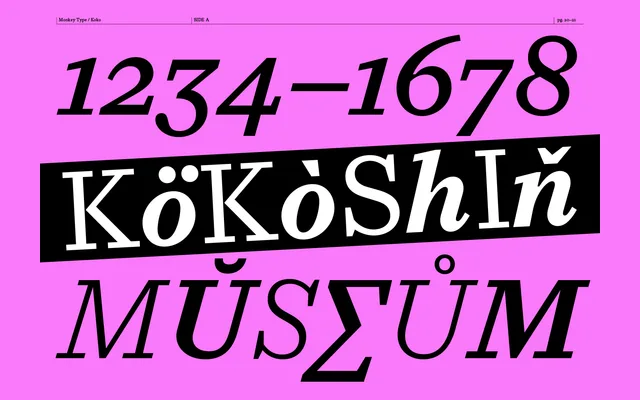
Koko specimen from Monkey Type

Koko is a slab serif that applies squared, blunt terminals to the proportions and editorial authority of Times New Roman and Plantin.

About

Koko takes the framework of classic newspaper typefaces – high contrast, sturdy stems, upright rhythm – and replaces their tapered bracketed serifs with squared, almost blunt terminals. The result sits between the broadsheet tradition and something more architectural: grounded rather than delicate, assured rather than decorative. Five weights with matching italics make it usable across body copy and display settings in print-first editorial work.

Classification

Draws formal ancestry from transitional serif models – Times New Roman and Plantin – but replaces their bracketed, tapered serifs with squared, blunt terminals. High contrast stems, upright structure, and a humanist underlying rhythm give it editorial authority. Five weights plus matching italics; no optical sizes or condensed cuts.

Weights

LightLight ItalicRegularRegular ItalicMediumMedium ItalicSemiboldSemibold ItalicBoldBold Italic

Languages

Latin

Tags

editorialnewspaperprinthigh-contrastslab serifpublishingbroadsheetdisplay