 MegaMegaTypeType
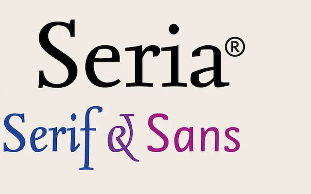
Martin Majoor's literary text serif, with long extenders, a small x-height and an upright italic.
About
Seria came out in 2000 as a book face for typographers who like a challenge: the x-height is small and the ascenders and descenders run long, so it sets with a lot of air between lines. Its italic stands nearly upright and does the work of emphasis through letter shape alone. It won certificates of excellence from the ISTD and ATypI in 2003.
Classification
Literary humanist serif with very long ascenders and descenders and a small x-height. The italic is an upright italic rather than a slanted roman. Shares its skeleton with Seria Sans.
Weights
RegularItalicBoldBold Italic
Languages
Latin
Tags
humanistbookliteraryeditorialsuperfamilydutch