 MegaMegaTypeType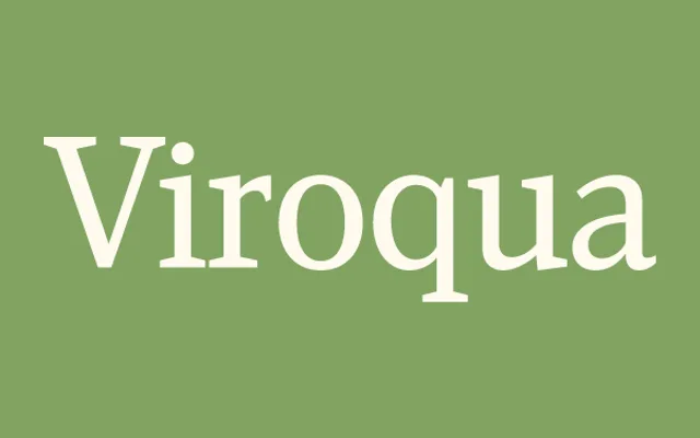
A ground-up redesign of Kandal, one of Simonson's first typefaces, done thirty years on with a full weight range and figure options.
About
Viroqua reworks Kandal, one of Simonson's earliest typefaces, applying three decades of extra type-design experience. It keeps a hybrid of old-style detailing and modern proportions, with low contrast and wedge-shaped slab serifs, comfortable enough for text while its boldest weights carry real display impact. Small caps, old-style and lining figures in both proportional and tabular forms, superscript and subscript figures, fractions and dingbats round it out.
Classification
A low-contrast wedge-serif redesign of an earlier slab-leaning face, classed slab for its consistent stroke weight and wedge serifs.
Weights
ThinLightRegularSemi BoldBoldExtra BoldBlack
Languages
Latin Extended
Tags
wedge-serifold-styleslabtextdisplay