 MegaMegaTypeType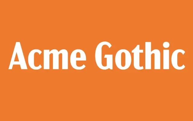
A five-width, five-weight American gothic revival built to cover the plain, workman-like lettering style other revivals overdo or under-do.
About
Acme Gothic revives the thick-and-thin gothic lettering common in the US in the early twentieth century, a style Mark Simonson felt existing revivals always pushed too far in one direction or another. Twenty-five styles across five widths and five weights give it a lot of range for a single design idea.
Classification
A thick-and-thin American gothic revival; the strong stroke contrast puts it with the gothic/grotesque family rather than a plain grotesque.
Weights
LightRegularSemi BoldBoldBlack
Optical sizes and widths
CompressedCondensedstandardWideExtra Wide
Languages
Latin Extended
Tags
gothicvintagedisplaybrandingvernacularwide-family