 MegaMegaTypeType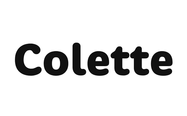
A humanist serif by Greg Lindy originally developed for a children's hospital capital campaign, available in five weights with matching italics across ten styles.
About
Designed with warmth and structure in equal measure, the family moves from elegant restraint in its lighter weights to a more assertive character in the heavier cuts. The typeface was initially inspired by the birth of Greg Lindy's daughter and refined after its campaign debut to include additional weights, italics and an extended Latin character set. Ten OTF styles are available with web font formats included.
Classification
A humanist serif with warm, open forms that shift in character from elegant and reserved in lighter weights to expressive in heavier cuts, suggesting a design rooted in readable, friendly letterforms rather than strict classical models.