 MegaMegaTypeType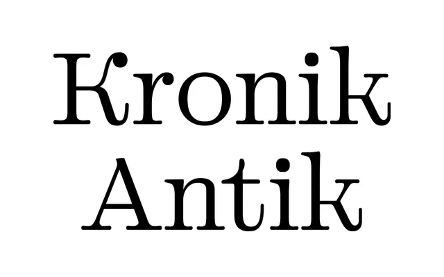
A Swiss-designed serif in nine weights that merges Didone contrast with slab-serif structure and near-monolinear text weights, offered in dedicated Text and Display optical sizes.
About
Kronik Antik sits at the junction of the Didone tradition, slab-serif lineage and the geometric proportions typical of sans-serifs. In its Text optical size the lighter weights approach a monolinear quality, while heavier weights become warmer in character; the Display optical size amplifies vertical rhythm and Didone contrast. It forms the proportional and stylistic foundation for the broader Kronik family, which also includes Kronik Vision and Kronik Grotesk.
Classification
The foundry describes it as bridging Didone, slab-serif and geometric sans-serif traditions. The display optical size strongly emphasises Didone high contrast and vertical rhythm, while the text sizes adopt a near-monolinear quality in lighter weights, placing it firmly in the transitional serif category with slab and didone inflections.