 MegaMegaTypeType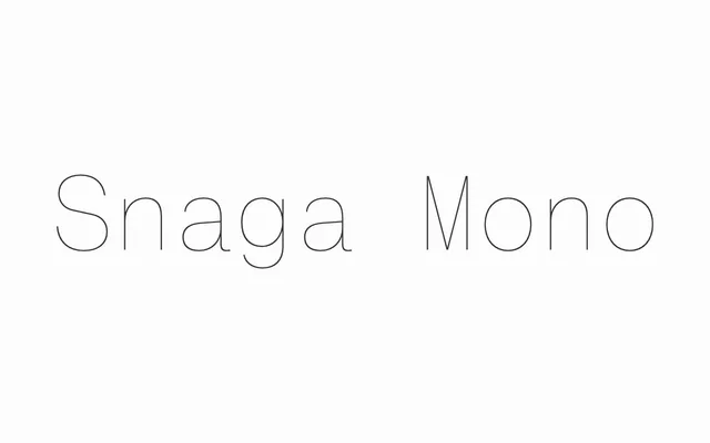
A ten-weight monospaced extension of the Snaga grotesque family, covering Latin, Greek and Cyrillic including Bulgarian Cyrillic alternates, with matching italics throughout.
About
Each glyph has been rebalanced to preserve the visual rhythm and grey value of the parent Snaga grotesque despite the constraint of equal character widths, resulting in unusually even texture for a fixed-width design. Lively terminals, subtle stroke modulation and compact proportions make it serviceable for code and tabular data as well as editorial and interface contexts. Bulgarian Cyrillic alternates, a hallmark of the wider Snaga family, are carried over into the mono cut.
Classification
A fixed-width sans-serif with monolinear texture and rational grotesque construction, explicitly conceived as the monospaced extension of the Snaga grotesque family. Equal character widths with carefully rebalanced spacing distinguish it from geometric typewriter designs.