 MegaMegaTypeType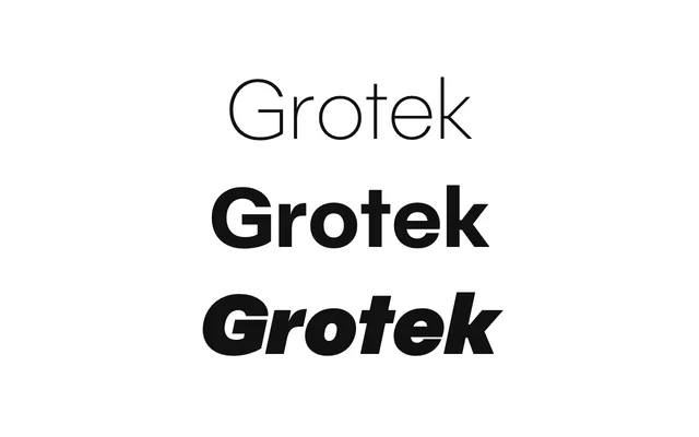
Lettersetal's flagship grotesque: measured, clear and built for branding work.
About
Grotek is a nine-weight grotesque with italics, sold as statics and as a variable font with weight and slant axes. The site sets it against rOtring pencils and drawing tools, and the letterforms carry that precision without turning cold. It is the base for most of the Experim-etal experiments.
Classification
A clean, low-contrast grotesque with technical, drafting-tool overtones; nine weights from Hairline to Black with matching italics.
Weights
HairlineThinExtraLightLightRegularMediumBoldExtraBoldBlack
Optical sizes and widths
Variable: wght 50–900, slnt 0 to -12
Family
Grotek VF
Languages
Latin
Tags
grotesqueneutralbrandingtextheadlinevariabletechnicalinterface