 MegaMegaTypeType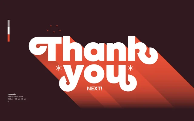
A geometric sans-serif in two subfamilies – a display-oriented standard and a more neutral Alt – each spanning nine weights with swash characters and support for over 200 Latin-based languages.
About
Designed by Sofia Mohr and released in 2020, Mangueira pairs geometric construction with vertical terminals reminiscent of humanist sans-serifs, giving it a distinctive warmth. Distinctive letterforms in the 'g' and 'k', alongside a generous set of swashes accessible via OpenType, add character without sacrificing versatility. The 502-character set covers over 200 Latin-based languages, making it suitable for editorial, branding, packaging, web and broadcast contexts.
Classification
A geometric sans-serif with vertical terminals that draw from humanist sans traditions, combining circular construction with more organic detailing in glyphs such as the 'g' and 'k'.