 MegaMegaTypeType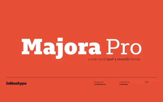
A humanist slab serif in eight weights with matching italics, extended by a stencil subfamily suited to signage and packaging.
About
Named after a Portuguese historical toy manufacturer, Majora Pro pairs moderate stroke contrast with humanist letterforms that hold up across both display and continuous text settings. The main family runs from Thin to Black with matching italics, while the Stencil subfamily provides eight upright cuts for titles, headings and packaging work. The 750-character set includes small caps, multiple figure styles and alternate glyphs, covering over 200 Latin-based languages.
Classification
A slab serif with humanistic features and moderate stroke contrast, placing it in the humanist slab tradition rather than a geometric or Egyptian model. The stencil subfamily shares the same upright skeleton.