 MegaMegaTypeType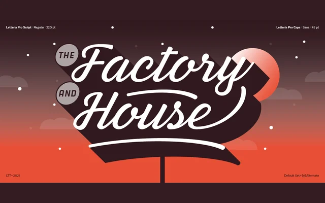
A three-part display family combining a calligraphic main face in five weights with all-caps sans and slab companions referencing De Stijl geometry, aimed at branding and packaging.
About
The primary family draws on the broad nib pen and brush for its stroke contrast, available in five weights from Thin to Black with ligatures and swashes throughout. The companion Caps family offers single-weight sans and slab cuts with a more mechanical, geometric character suited to creating hierarchy within a layout. Together the seven styles cover more than 200 languages within the Latin script.
Classification
Combines broad nib pen and brush influences across five weights, with companion all-caps variants in sans and slab cuts referencing De Stijl geometric construction. The mix of calligraphic and mechanical approaches places it firmly in the display category.