 MegaMegaTypeType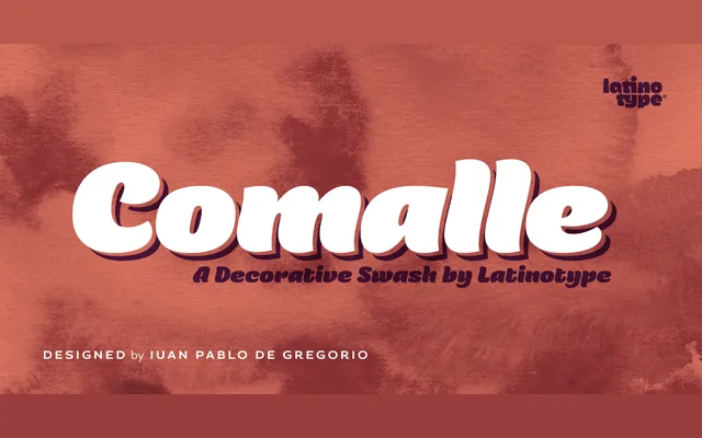
A single-weight display face by Juan Pablo de Gregorio built around deliberately heavy strokes and carefully sculpted counter spaces inspired by handwritten script.
About
Comalle inverts the usual balance between black and white, using thicker outlines than counter forms so that the letterforms fill the page with visual weight. The design process prioritised the counter spaces above all else, with the bulk of detail work concentrated there rather than on the outer strokes. The result is a face intended to create immediate impact through density rather than lightness.
Classification
A display face with thick strokes derived loosely from handwritten script but without strict calligraphic structure. Its heavy outlines and carefully considered counter spaces place it firmly in expressive display territory.